


CSS
Cascading Style Sheets is the primary styling language used to describe the style and layout of HTML documents
- Cascading
- order of stylesheets used, three main categories:
- User Agent stylesheets: browser defaults for styles, lowest precedence
- User stylesheets: user preferences saved in the browser, medium precedence
- Author stylesheets: CSS code we write, highest precedence (assuming !important has not been used)
- Declaration
- property: value;
- Declaration Block
- a group of declarations surrounded by {}
- Ruleset
- A selector followed by a declaration block for styling matching elements, with the declarations inside declaration block
selector {
  property: value;
  property: value;
}- <link>
- A self-closing HTML tag for linking to external resources, usually CSS stylesheets. When linking to a stylesheet, <link> will take two attributes:
- rel: relationship to other doc (for CSS files, this should be stylesheet)
- href: path to linked file, relative or absolute
- A self-closing HTML tag for linking to external resources, usually CSS stylesheets. When linking to a stylesheet, <link> will take two attributes:
__
__
Selectors
A pattern used at the beginning of a ruleset for choosing which elements will be affected by the declarations
- Type selector: selects all elements that have the given node name
- elementname
- Class selector: selects all elements that have the given class attribute
- .classname
- ID selector: selects an element based on the value of its id attribute. (should be only one element with a given ID in a doc)
- #idname
- Attribute selector: selects all elements that have the given attribute
- [attr] [attr=value] [attr~=value] [attr|=value] [attr^=value] [attr$=value] [attr*=value]
- [href*="algoexpert.io"] selects all elements with an href attribute with the text "algoexpert.io" at any location
- [href$="algoexpert.io"] selects all elements with an href attribute with the text "algoexpert.io" at the end of the value
- [href^="https://algoexpert.io"] selects all elements with an href attribute with the text "https://algoexpert.io" at the beginning of the value
- [attr] [attr=value] [attr~=value] [attr|=value] [attr^=value] [attr$=value] [attr*=value]
- Combinator: combines multiple selectors to select elements based on their location in the DOM
- Descendant combinator: The " " (space) combinator selects nodes that are descendants of the first element
- A, B
- div, span will match both <span> and <div> elements.
- Child combinator: The > combinator selects nodes that are direct children of the first element
- Sibling combinator: The ~ combinator selects siblings. This means that the second element follows the first (though not necessarily immediately), and both share the same parent.
- Adjacent sibling combinator: The + combinator matches the second element only if it immediately follows the first element.
- Descendant combinator: The " " (space) combinator selects nodes that are descendants of the first element
/*Type Selector*/
h1 {
  color: red;
}

/*Class Selector*/
.center {
  text-align: center;
}

/*ID selector*/
#paragraph1 {
  color: red;
}

/*Attribute selector*/
[href*="algoexpert.io"] {
  color: orange;
}

[href$="algoexpert.io"] {
  color: yellow;
}

[href^="https://algoexpert.io"] {
  color: green;
}

/*Combinators*/
/*Descendant combinator*/
div span {
  color: blue;
}

/*Child combinator*/
ul > li {
  color: purple;
}

/*Sibling combinator*/
p ~ span {
  color: black;
}

/*Adjacent sibling combinator*/
h2 + p {
  color: white;
}
__
__
Pseudo Classes And Elements
- Pseudo Class: addition to a CSS selector for selecting based on the current state of the element
- button:hover selects buttons that are hovered over
- Pseudo Element: addition to a CSS selector for selecting a specific portion of the element
- p::first-letter selects the first letter of paragraphs
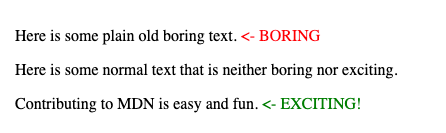
- ::before and ::after insert children before or after the content of the element, allowing for styling before or after the content (often used with the content property)
.exciting-text::after {
  content: " <- EXCITING!";
  color: green;
}

.boring-text::after {
  content: " <- BORING";
  color: red;
}
__
__
Selector Specificity
The algorithm used by the browser to determine which CSS declarations to use when an element is selected by two rulesets with the same property
- Calculated by counting the number of each selector type involved in a selector and multiplying by a weight:
- Inline Styles: 1000
- IDs: 100
- Classes: 10
- Pseudo-Classes: 10
- Attributes: 10
- Elements: 1
- Pseudo-Elements: 1
__
__
CSS Units
- Absolute unit: a unit's value is not dependent on something else, size will be constant regardless of the context (px)
- Relative unit: a unit's value is dependent on something else
- em: relative to the font size
- If the font size is 14px, then 1.5em would be 21px
- If the em unit is used to set font size, it will be relative to the parent's font size.
- rem: relative to the root element's font size (16px by default)
- the author stylesheets can override this by setting a font size on the html selector or the :root pseudo class
- By default 1.5rem will be 24px
- %: a percentage of the parents value for the same property
- For example, a width of 50% would be half the size of the parent element's width
- vw: a percentage of the width of the viewport
- 50vw is half of the width of the viewport
- vh: a percentage of the height of the viewport
- 50vh is half of the height of the viewport
- ch: number of characters on a line, based on the size of the "0" character in the element's font
- Useful to prevent paragraphs from spanning more than ~70 characters in width
- em: relative to the font size
__
__
Block vs. Inline
- Block Element: element with its display property set to block
- starts on new line and spans entire width of their parent by default
- Inline Element: element with its display property set to inline
- starts immediately after the content before them, on same line
- spans the width of their content
- width and height properties have no effect on them
- Inline-Block Element: element with its displat propert set to inline-block
- start immediately after the content before them, on same line
- span the width of their content by default, but can be changed
__
__
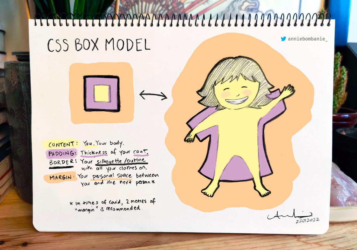
Box Model
A box surrounding all elements on the document used for layout
- content, padding, border and margin

__
padding
creates extra space between the content and border
- padding is shorthand for: padding-top, right, bottom, left
__
border
creates border around content and padding
- border: 1px solid black (shorthand for border-color, style, width)
- border-radius: creates rounded corners of element, regardless of if it has a border
- 50% is used on square elements to create a circle
- border-top, right, bottom, left: sets border of single side of element
__
margin
creates extra space around element
- margin (shorthand for margin-top, right, bottom, left)
- "auto" lets the browser choose margins, usually centers block elements horizontally
- Adjacent horizontal margins are added together to determine the space between elements
- Vertical margins are usually collapsed, larger margin value will be used
__
__
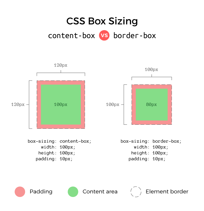
Box-sizing
Specifies width and height of element
- content-box: sets width and height of content (default)
- box-sizing: content-box; (120px total width)
- width: 100px;
- height: 100px;
- padding: 10px;
- border: 0px;
- border-box: sets padding and border of content
- box-sizing: border-box; (100px total width)
- width: 100px;
- height: 100px;
- padding: 10px;
- border: 0px;

__
__
Position
Sets how browser positions an element
- static: element positioned at the natural flow of the document (default)
- fixed: element positioned relative to the viewport and removed from the normal flow of the document
- top, left, right, bottom properties move the element
- relative: element positioned at the natural flow of the document, but can be repositioned with
- top, left, right, bottom relative to its natural position on document
- sticky: element acts similar to a relative positioned element, but once it scrolls off screen it stays fixed to the screen
- acts as position: fixed
- absolute: element positioned relative to the document instead of the viewport. By default, this will act the same as fixed
- As the page is scrolled, moves with the page instead of staying at same viewport location
- But, if any element above it in the DOM (ancestor) has a position value other than static, then it's positioned relative to the nearest ancestor position
__
__
Stacking Contexts
A group of elements positioned together on the z-axis
- Stacking contexts can be nested within other stacking contexts
- z-index values are used to determine the layering of elements with the same stacking context parent
__
__
Flexbox
A layout model for building responsive designs with rows/columns
- An element can be a flex container with display: flex, and all of its direct children are flex items

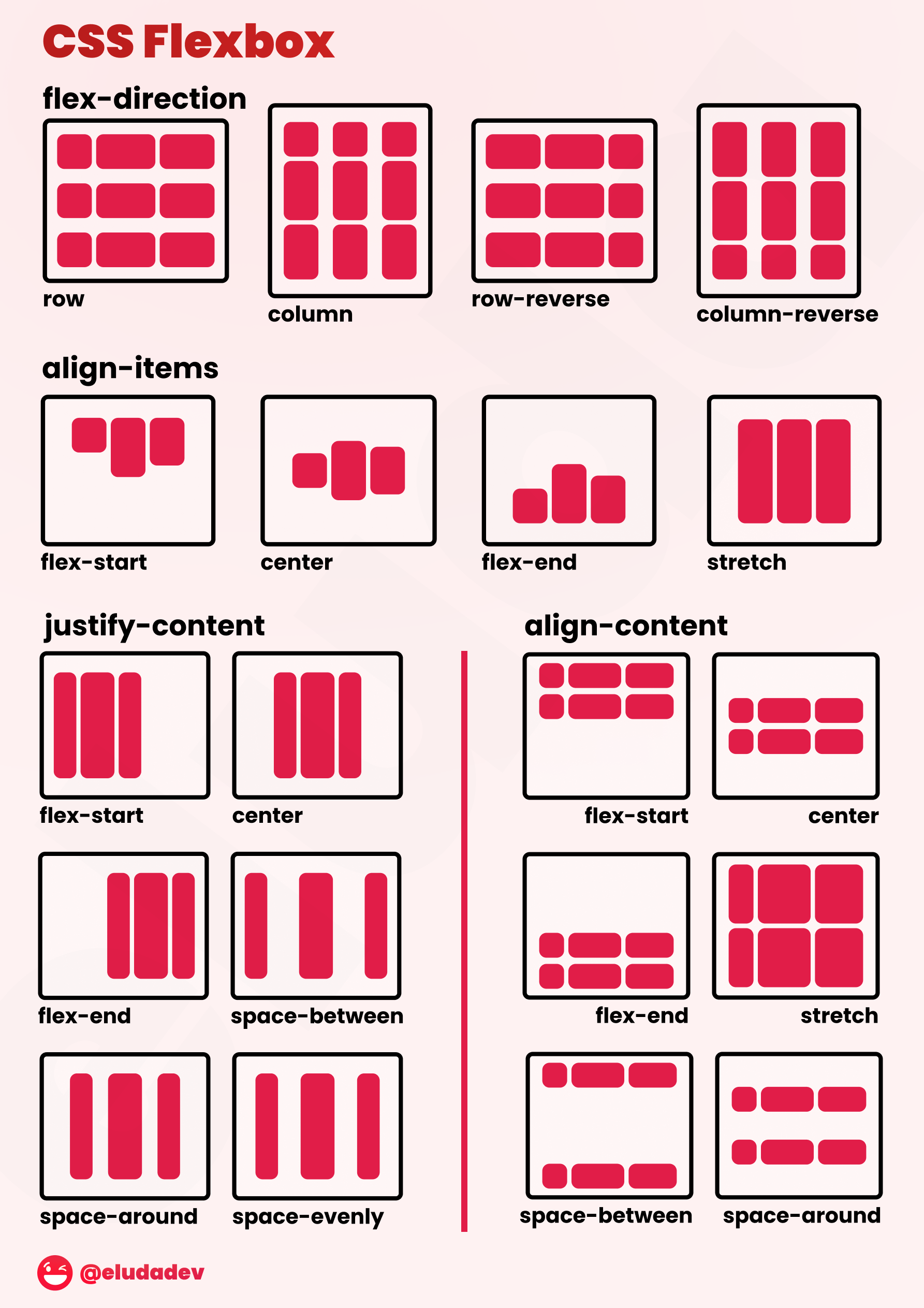
Properties used to layout flex containers' flex items:
- flex-direction: direction of main-axis (row/column)
- row/column-reverse to reverse order of flex items
- justify-content: justify elements on main-axis
- flex-start/end, center, space-around/between/evenly
- align-items: align elements on cross-axis
- elements not selected by flex-direction
- flex-start/end/center/baseline/stretch
- flex-wrap: Determines if flex items can wrap to new lines
- nowrap/wrap/wrap-reverse
- align-content: position lines on cross-axis when flex items are wrapping on multiple lines
- flex-start/end, center, space-around/between, stretch
- flex-flow: flex-direction and flex-wrap (shorthand)
- flex-flow: row wrap;
- gap: space between flex items
- takes one or two length values (row gap and column gap)
- row-gap and column-gap property individually sets gap between rows and columns
__
Properties used to position flex items:
- align-self: overrides align-items value used for flex container
- flex-basis: sets initial size of item on main-axis
- acts as row axis width and column axis height
- flex-grow: item grows into extra space
- 0 means item will not grow, otherwise, takes up as much extra space. Higher the value, the more the item takes up space proportionally
- If item A is 1 and item B is 2, item B takes up twice as much extra space (doesn't mean twice as large)
- flex-shrink: item shrinks when flex items are too large for container
- 0 will not shrink, otherwise, all shrink proportionally based on their values. Higher the value, the more the item shrinks proportionally
- flex: flex-grow/shrink/basis (shorthand)
- order: item is moved to different location amongst other items rather than DOM order
- flex items default value is 0
- -1 moves item before all other items that haven't changed order
- 1 moves item to end
__
__
CSS Grid
A layout model used for creating responsive layouts with multiple rows/columns
- An element can be made a grid container with display: grid, and all of its direct children are grid items in a single cell
- grid area: a rectangular subsection of a grid
- grid lines: dividers between each row and column
- tracks: rows and columns
__
Grid containers' properties used to layout their grid items:
- grid-template-columns: number of columns and their sizes. The unit fr can be used as a fractional unit to create a responsive design
- grid-template-rows: number of rows and their sizes. The unit fr can be used as a fractional unit to create a responsive design
- grid-template-areas: names for grid areas that grid items can place themselves in
- justify-content: how grid tracks are aligned on inline-axis (row)
- start, end, center, space-around/between/evenly
- align-content: how grid tracks are aligned on block-axis (column)
- start, end, center, space-around/between/evenly
- align-items: how grid items are aligned in columns (block-axis)
- start, end, center, stretch
- justify-items: how grid items are aligned in rows (inline-axis)
- start, end, center, stretch
- place-items: shorthand for align-items and justify-items
- If one value, applies to both
- If two, applies to align-items and justify-items respectively
- gap: space between grid items
- one or two lengths
- If two, row gap and a column gap respectively
- Alternatively, a row-gap and column-gap property can be specified to individually set the gap between rows and columns
- one or two lengths
__
For grid items, these are some of the most common properties used to position themselves:
- grid-column-start: which column item starts on, based on a line number
- grid-column-end: which column this item ends on, based on a line number
- grid-column: shorthand for both grid-column-start and grid-column-end specified in the format start / end
- grid-row-start: which row item starts on, based on a line number
- grid-row-end: which row this item ends on, based on a line number
- grid-row: shorthand for both grid-row-start and grid-row-end specified in the format start / end
- grid-area: places item in a grid-area based on a name created in grid-template-areas
- align-self: overrides align-items value used for the grid container
- justify-self: overrides justify-items value used for the grid container
- place-self: shorthand for both align-self and justify-self in the same format as place-items
__
__
Image Sprite
A group of images all included in a single image file
- These images are split on the client using background-image and background-position
- Sprites reduce the total file size and number of files the client needs to download, which decreases page load times
__
__
CSS Inheritance
How elements choose a value when none has been explicitly declared in any stylesheet. All properties are either inherited properties or non-inherited properties. Inherited properties will take their parent's value in the case no value has been set for the property. Non-inherited properties on the other hand will be set to initial in this case.
__
While the default groupings of inherited and non-inherited properties is usually all that's needed, this can be changed by using these values:
- inherit: The value should inherit from its parent, regardless of if it is normally an inherited property.
- initial: The value should be set to the value defined in the CSS specification. Note this is oftentimes different from browser defaults.
- unset: The value should be set to inherit if it is normally an inherited property, otherwise initial. This can be useful for "resetting" browser defaults from the user agent stylesheet.
- revert: The value should revert back to the next stylesheet in the cascade. For author stylesheets, this would act as if the author did not write any declaration for the property, but it would still honor the user agent and user stylesheets as normal.
__
__
Responsive Design
Mobile First Design
- Building websites or applications with mobile devices as the primary use case, then scaling them up to larger devices with responsive CSS
__
__
Transitions
A css module for smoothly transitioning between values when a value is changed
- transition-property: name of the CSS property to transition
- transition-duration: how long the transition should take
- transition-timing-function: how the transition should progress
- linear, ease-in, or custom values using the cubic-bezier() or steps() functions.
- transition-delay: how long to wait before starting the transition
- Alternatively, "transition" is shorthand for all of these values
- The first time value will be used for the duration, and the second will be used for a delay. Other than that, order doesn't matter
transition: width 1s linear 2s;__
__
Animations
A css module for animating properties. An animation is defined using keyframes as well as these properties:
- animation-name: The name of the keyframes animation.
- animation-duration: How long the animation should take.
- animation-fill-mode: If the element should stay in its animated position after the animation completes or if it should move to the starting position of the animation before it begins, specified with the backwards and forwards values respectively or both to follow the rules of both values.
- animation-direction: If the animation should play in normal or reverse order. A value of alternate can also be used to switch between normal and reverse, or alternate-reverse can be used to do the same, but starting with the reverse direction.
- animation-iteration-count: How many times to run the animation, or infinite to run the animation indefinitely.
- animation-play-state: If the animation is currently running or paused. This is particularly useful for pausing an animation using JavaScript.
- animation-timing-function: How the animation should progress through the keyframes. This can take a variety of keyword values, such as linear and ease-in, or custom values using the cubic-bezier() or steps() functions.
- animation-delay: How long to wait before starting the animation.
- animation (shorthand)
- first time value used for duration, second time used for delay
- Othewise, order will not matter assuming the animation-name is not using a conflicting keyword with another possible value
- For example after a two second delay, this would run the move animation over three seconds with the ease timing function
- The animation continues to run indefinitely, alternating the order each time
animation: move 3s ease infinite alternate 2s;__
__
@keyframes
A keyword for defining points within an animation timeline. An animation is made up of a variety of keyframes, and the browser will fill in the spaces between the keyframes based on the timing function
@keyframes animation-name {
  from {
    property: value;
    property: value;
  }

  50% {
    property: value;
    property: value;
  }

  to {
    property: value;
    property: value;
  }
}
__
__
CSS Variables
Custom Properties
Also known as variables, these are used to keep track of repeated values in CSS. Custom properties always start with -- and can be included in any ruleset. However, most commonly they are defined on the :root ruleset so the variables will be accessible throughout the website. Custom properties are then used with the var() CSS function. For example, this code defines a custom property called --main-color and uses it for a background color:
:root {
  --main-color: #00334C;
}

main {
  background-color: var(--main-color);
}
__
__
Frameworks and Preprocessors
CSS Framework (quick development)
Pre-written code that can be used to simplify development. Often include ready to use classes, pre-built components, and responsive layout systems
- Tailwind: customiziable utility classes
- Bootstrap: Responsive pre-built components, grid layout system
- Materialize: similar to Bootstrap, follows Google Material UI
- Foundation: Highly flexible UI components
- Bulma: CSS only framework
__
CSS Preprocessor (simplify CSS)
A program that converts code of another syntax into CSS that the browser can understand. Usually these add new features to CSS to make the code easier to read, write, maintain
- Sass: variables, mixins (allows you to re-use blocks of code), @extends (allow classes to extend one another), nesting, looping
- LESS: JS based, simple to learn
- stylus: optional braces/colons/semi-colons/commas, similar features to Sass
- PostCSS: highly customizable plugin collection
__
__
CSS Methodologies and Best Practices
BEM
The "Block, Element, Modifier" CSS methodology. This breaks CSS classes into three categories:
- Blocks: Standalone elements with their own meaning. These are referenced simply by the name of the block such as class="menu".
- Elements: Parts of a block without their own meaning. These are referenced by the name of the block, two underscores then the name of the element such as class="menu__item".
- Modifiers: Flags to change styles for blocks or elements, such as disabled or selected. These are prefixed by the class they modify and two dashes, and they are included in addition to that original class such as class="menu menu--disabled".
__
OOCSS
The "Object-Oriented" CSS methodology. This is based on object-oriented programming principles, which can be applied to CSS class design by treating UI components as objects. Styles are then given one of two categories:
- Structure: "Invisible" properties such as width and margin.
- Skin: "Visible" properties such as color and border.
Along with separating structure and skin into classes, OOCSS also makes a clear distinction between content and containers. The idea here is that containers should function the same, regardless of the content inside of them. Moreover, content should not depend on the container it is nested within.
__
Atomic CSS
A CSS methodology based on the idea of minimizing any repeated declarations. Rather than creating classes based on components, Atomic CSS creates utility classes based on single declarations. For example, in Atomic CSS a "margin-12" class might be created that adds 12 pixels of margin, rather than including that declaration on all of the components needing 12 pixels of margin.
__
SMACSS
The "Scalable and Modular Architecture For CSS" methodology, usually pronounced as "smacks". This splits CSS into five different categories, each of which get their own file:
- Base: Page defaults, usually just type selectors.
- Layout: Major structural layout of the page, using ID and class selectors. The classes are usually prefixed with l- or layout-. For example, a navigation element might have the class l-nav.
- Module: Smaller reusable components, usually using class selectors without any name prefixes.
- State: Specific states for layouts or modules, such as disabled or selected states, usually using class selectors again.
- Theme: Style rules for layouts and modules related to a theme, oftentimes based on user preferences such as a dark mode.
__
ITCSS
The "Inverted Triangle" CSS methodology. This methodology is mostly focused on the order of CSS code, rather than having opinions on naming conventions. The primary idea here is to have generic styles first, which should have the largest reach across elements and the least specific selectors. The exact layers of the triangle can be changed to fit the needs of a specific project, but a general structure looks like this:
- Settings: Global variables affecting the entire website.
- Tools: Mixins and functions for use with preprocessors.
- Generic: High level generic styles, usually to reset browser defaults for consistency across browsers.
- Elements: Defaults for elements using type selectors.
- Objects: The most generic classes, oftentimes for larger containers.
- Components: Classes for individual UI components.
- Trumps: !important overrides for when they are needed.